We’ve been craving a change in our look for a while now. And we’re pleased to finally debut it!
If you’re reading this in e-mail or in an RSS reader, we invite you to click through to :
.. and see the entire new blog design we just completed.
The evolution of the logo
Join us on a trip down memory lane, as I reflect about how our new logo came to be.
We mocked up a logo one day on the side of the road back in 2007, just so we had something to print on a contact card.

It wasn’t bad, but it was never meant to be our logo long term. Somehow it stuck, and over 4 years later we were still using it. We’ve been the recipient of many jokes for using the papyrus font, which is considered over-used in the graphic design world (much like comic sans).
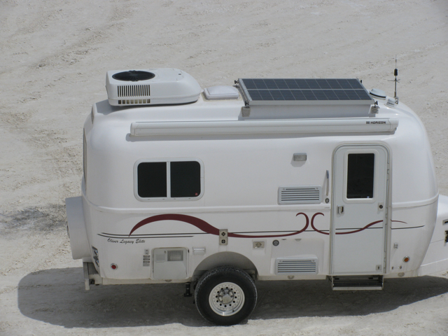
When we were having our Oliver Travel Trailer constructed in 2008, they told us we could have anything we wanted printed on the outside. So a friend of ours worked with us to create this symbol to be our ‘swoosh’.

 We started out the design to just be a unique symbol – but it turned into something much more. To most, the symbol probably appeared like any generic RV swoosh graphic.
But really, the symbol has deep meaning to us.
In the center, is a back-to-back C and C (representing Chris & Cherie) in an abstract homage to Burning Man. Burning Man is a very important part of lives, and where we had our commitment ceremony with each other in 2007.
The lines represent our lives converging and the adventures ahead for us together. Suffice it to say, selling our Oliver that was so custom made for us had extra difficulty because of the symbolism put into the graphic.
Over the years, the symbol has grown in meaning for us.
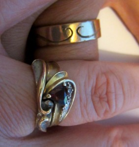
Last year, we had commitment rings forged for us by my artist & jeweler friend Barb Baur. She did the wax carving when we met up at Gateway Burn (the St. Louis regional burn) last summer, and integrated in the symbol. The rings themselves were forged with ashes from the 2007 Burning Man temple, where we left our vows to each other. (Awww.. is this getting too sappy yet??)
We mentioned earlier in the year that we wanted a new look for our blog and Technomadia branding. Our technomadic graphic designer friend Karen Nace jumped up and down to be our designer.
With all the vintage bus hunting and projects, coming up with a design was put on the back burner for us all. But during our recent rendezvouses, our new design came together.
And it was an obvious choice to integrate in the symbol that has come to mean so much to us.
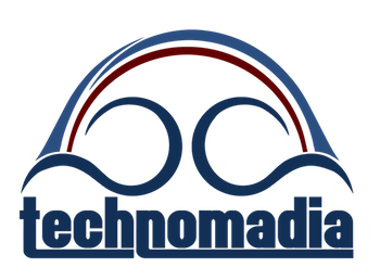
When Karen first showed us what she had in mind – we were in love. It bridges our past to our future by integrating in the old color (red) from our past symbol in with the new color (blue) of our vintage bus. The font she designed for us better separates the ‘Tech’ and ‘Nomad’ part of our name… and has a bit of a vintage feel. And converting the lines into a circular arch represents all the rainbows that seem to follow us in our travels.
I love the history of how this logo has evolved, bringing together so many aspects of our lives. And how so many important people in our lives were involved in creating it over the years.
I smile with delight every time I see it.. and we are pleased to finally share it with you.
(And seriously, if you ever need custom graphic work – Karen is an excellent choice!)
The new blog design
Previously we had been using Thrilling Theme by Cody McKibben – which is an excellent free WordPress theme all and all. However, we had just about maxed out on customizing it to differentiate ourselves from the other 15,000 folks who began using it since we switched.
And.. well.. a new look every so often is always a good thing!
Another friend of ours had been doing some development with the paid theme PageLines, and offered to set us up a copy to play with.
I can’t say we’re totally in love with it yet, but it’s a start to getting us to the fresh new look we want. And hopefully it’ll give us a good platform to roll out some new ideas we have to add resources. There will be much tweaking, I’m sure.
With all this change, you might be wondering if we’re setting ourselves up to become more commerial. And nope. Our intentions with Technomadia.com remains the same. We enjoy sharing and blogging for the sake of sharing. We’ll remain mostly ad-free, and only promoting products we genuinely love as part of our authentic tales of travel & technology.
We’ll of course continue to produce travel apps and perhaps an eBook here and there, and you will hear about them. But our blog’s focus remains on sharing what we learn on the road, and of course, a way to meet other amazing people!


Check out the facelift! It looks sharp!
Very cool…love the new sleek look. Fun to hear about the evolution of your design logo too.
Nina
Thanks Nina… ‘sleek’ — thanks for the compliment
Site looks great and the logo is very cool!
My ‘about us’ menu item is getting pushed to line two in Firefox, but it’s fine in Chrome. Hooray for browsers!
Thanks for the feedback, Paul – we don’t use Chrome, so hadn’t noticed that. Will see if there’s anything we can do to tweak it a bit. We did notice that same thing on the iPad.
It is in fact a vintage and beautiful logo! Thank you for sharing the detailed story.
All the best for you.
Sarah
Thanks, Sarah!
I like sappy and I love the new logo! Thanks for sharing the meaning behind it.
*whew* Glad the sap wasn’t too much Thanks
Great story and logo! The vintage feel is a nice accompaniment to your vintage bus, too. Hope your C’s remain entwined in love and adventure for many years to come!
Awww…. thanks Schelby!
As we make the change to Fall, all to soon for those of us in the Northwest, I continue to enjoy the news from our intrepid explorers, C&C. Travel on Technomadians.
Thanks, Jay! And thanks for following along with us.
I enjoyed hearing about your logo in that much detail. It’s truly an evolution.
I like the new look because it is clean and fast-loading. I’m sure you will make it ever more your own as you continue.
Thanks for letting us know it’s faster loading… we weren’t able to tell as we’ve been developing via satellite (everything is sluggish). Good know for sure!
Congrats on the change… It’s always exciting to unveil a new look. I like how your logo actually has a deep meaning behind it. That’s very cool.
Thanks Scott.. glad we could share the story.